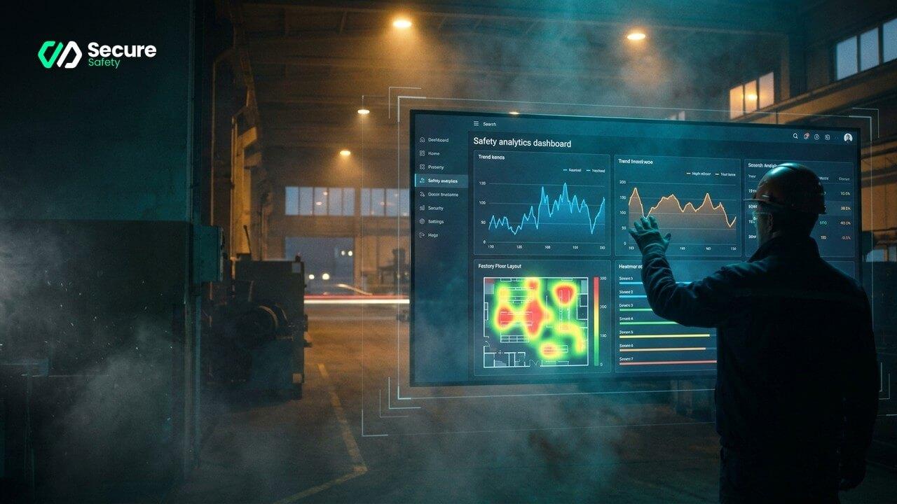
Every safety manager knows the meeting. It is the first Monday of the month, the room is a little too warm, and a slide goes up on the wall. Lost-time injury rate: down. Or up. A bar chart of recordables by quarter. A pie chart of incidents by category. Everyone nods. Someone asks a question about the spike in March. Nobody can answer it, because March was four months ago and the people involved have moved on.
Then the slide changes, and the month begins again — exactly as unsafe as it was before.
This is the quiet failure of most safety reporting. The numbers are accurate. The charts are tidy. And they change nothing, because they describe a past that no one can reach back and fix.
Lagging numbers describe the crash. They cannot prevent it.
The problem is not effort. It is arithmetic. A dashboard built on injuries, near-misses and recordables is a dashboard built on rare events. A serious incident might happen once a quarter, if you are unlucky, or once a year, if you are careful. You cannot steer a facility on a signal that fires that infrequently. By the time the line on the chart moves, the harm has already happened.
Worse, lagging indicators reward silence. A month with no reported incidents looks identical to a month where nothing dangerous happened at all — when in fact one may be a facility running hot on luck, the other genuinely under control. The dashboard cannot tell the difference. Neither, then, can you.
To change behaviour, you need to see the behaviour. Not the injury it eventually causes — the behaviour itself, the day it happens, while there is still time to have a word.
Leading indicators are the behaviours, not the bruises
A leading indicator is simply an unsafe act observed before anything goes wrong. A worker crossing a live vehicle lane. A helmet not worn in a designated zone. A colleague standing inside a red-zone exclusion while a load is moving. A near-miss between a reversing forklift and a person on foot who never even noticed.
These things happen hundreds of times a week in any busy facility. Most are seen by no one. A few are caught by a supervisor who happens to be looking the right way at the right second. The overwhelming majority go unrecorded — which means they never reach your dashboard, and so your dashboard has never told you the truth about how your site actually behaves.
The purpose of computer vision on your existing cameras is to close that gap. It watches every lane, every zone, every shift, and it counts the unsafe acts the way a stopwatch counts seconds — patiently, without fatigue, without looking away. Suddenly the rarest data in safety becomes the most abundant. You are no longer reporting on a handful of incidents a quarter. You are reporting on thousands of observed behaviours a week.
From wallpaper to instrument
A dashboard becomes an instrument only when someone can act on what it shows. Three things separate the two.
It must be specific enough to point at
"PPE compliance: 94%" is wallpaper. "Bay 4, night shift, hi-vis compliance drops to 71% after 02:00" is an instruction. Actionable safety data names the place, the time and the behaviour, so that the person reading it knows exactly where to stand tomorrow. Aggregate figures comfort the boardroom; specific figures change the floor.
It must be fast enough to matter
A number that arrives a month late is a history lesson. A number that arrives the same shift is a chance. The most useful safety analytics KPIs are the ones a supervisor can see today and act on before the next break — the pedestrian-intrusion count on a particular crossing, the speed exceedances on a particular route, trending up in real time rather than surfacing in next quarter's review.
It must show the trend, not just the total
One unsafe act is noise. The same unsafe act, in the same place, climbing week over week, is a system telling you something. Good safety performance reporting plots the direction of travel, so you can tell the difference between a bad day and a bad habit — and intervene while it is still only a habit.
The proof is in the direction of the line
This approach was not designed in a workshop. It was forged offshore, on drill floors — the most demanding safety environment there is, where heavy equipment moves in tight spaces, tolerance for error is zero, and lives are genuinely on the line. In national oil-major operations, a major international port and an international airport, the same method held: watch the behaviours, count them honestly, feed them back fast. The detection runs at a sub-0.05% error rate, on-premise, so footage never leaves the site. And where it has been deployed to close the loop between observation and action, operators have measured reductions of roughly 90% in unsafe behaviour.
That last figure is the point. The dashboard did not simply describe the site more accurately. It changed how the site behaved — because for the first time the unsafe acts were visible, countable and impossible to ignore.
Feedback is what turns data into behaviour
None of this works if the numbers sit in a screen no one looks at. The mechanism that actually changes behaviour is old and human: people act differently when they know an unsafe act is seen, counted and followed up.
A leading-indicator dashboard makes that possible at the scale of a whole facility. A supervisor can start a shift knowing exactly which crossing needs watching. A toolbox talk can open with what happened on this floor, this week, rather than a generic slide about somebody else's accident. A manager can walk the site with a heatmap in mind and see the risk before it becomes an incident report.
The lagging numbers still matter — they are how you prove, at year's end, that the harm went down. But they are the scoreboard, not the game. The game is played in the thousands of small moments the old dashboard never saw.
Your cameras are already watching those moments. The only question is whether anyone gets to act on them.
What makes a safety dashboard actually change behaviour
The difference between a reporting tool and a management tool
A safety dashboard that displays data to be reported upward is a reporting tool. A safety dashboard that prompts specific management actions at the operational level is a management tool. The distinction is in the design: a management tool surfaces the two or three actions that need to happen this week, with enough context to take the action without additional investigation. A reporting tool aggregates data for a board presentation that happens once a quarter.
The most effective safety dashboards provide both layers: an operational view updated daily for the site manager and supervisors, and a strategic view updated weekly or monthly for the safety team and board. The operational view drives the week-to-week interventions; the strategic view tracks whether those interventions are working.
Surfacing the right metrics at the right time
The metrics that change behaviour are the ones that are specific, actionable and current. "Vehicle-pedestrian near-miss rate at Gate 3 crossing: 12 events this week, up from 7 last week" is a specific, actionable, current metric. "Total site near-miss rate: 34 events, below last month's 41" is a reporting metric. The first prompts an immediate management action. The second informs a review meeting.
AI monitoring generates the granular, location-specific, time-specific data that makes the specific and actionable format possible. The dashboard design must translate that data into the format that operational managers actually use: alerts that lead to actions, not tables that lead to discussions.
The feedback loop that sustains the programme
The safety programme that sustains over years is the one where the data demonstrates that actions lead to outcomes. An operational manager who added a mirror to Gate 3 corner following a spike in near-miss alerts, and then saw the near-miss rate drop by 70% over the following four weeks, is a manager who trusts the data and who will act on the next spike. Building and communicating this feedback loop — the action, the measurement, the result — is the management process that converts a monitoring system into a safety improvement programme.
Implementation checklist for an effective safety dashboard
- Define the primary audience for each dashboard view: operational (daily, site manager), safety programme (weekly, safety team), strategic (monthly, board/EHS director) — different audiences need different aggregation levels and different action implications
- Link every metric to an action owner: every metric on the dashboard should have a person who is responsible for acting when it moves in the wrong direction — metrics without action owners are reporting, not management
- Include the feedback loop: the dashboard should show not just current near-miss rates but also the interventions that have been made and their measured effect — this is what communicates that the programme is working
- Review the dashboard design quarterly: as the safety programme matures, the metrics that are most actionable change; quarterly reviews of the dashboard design ensure it remains relevant to the current priorities
See what your cameras have been missing — book a demo.